Customizing Your RPE Chart
Writing can be a difficult process, even for those without literacy issues! I know at least for me, I have all these ideas in my head and they all interrelate to one another. Writing is a process where I attempt to take those ideas, untangle them, and put them in a logical, readable form that makes an impact on the way people train or live. Because of the interrelatedness of different concepts – the sheer organic nature of athletic training – I often feel like I fall short in terms of getting my points across. That’s not a que for you to pity me – that gets us nowhere. It just means I continually try to improve what I write about.
Take for example the RPE Chart. In my book, The Reactive Training Manual, I discuss what the RPE chart is and how you use it. I also say that it is best if you customize the given RPE chart to fit yourself as an athlete. But that’s all I say. I don’t tell you how to go about that or anything. And as a result, I get the impression that very few people do any customizing to their RPE chart at all.
So what is a process-oriented guy like me to do about it? How about design a process that helps people fix this problem?
Okay, I will.
You start with step one…
The first thing we will need to do is start with a framework that applies to everyone.

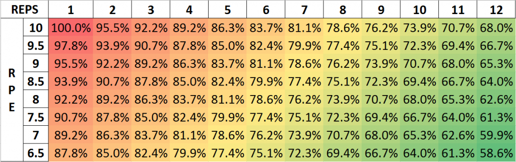
As you can see, here we have an empty framework of the RPE chart. You can go ahead and fill in 100% in your top right box because this is the very definition of 100% of your 1RM.
From here, it gets more difficult, but you can certainly manage if you take your time and understand the process.
Probably the most accurate way to come up with your RPE chart is to do a period of diagnostic work. This should take no more than a week to complete and ideally would be done after a test week.
The diagnostic work consists of 3 tests: a 1 rep max, a 4 rep max, and an 8 rep max. Spread them over a period of time that allows you to complete each test when rested. If you know me, you know I like to use examples in my processes. So let’s use one here as well.
Let’s say we have a lifter that is just about to finish a training cycle. His last week of the training cycle, he has a test day in the gym where he does a mock-meet. He maxes his squat, bench, and deadlift. This provides his 100% data for the rest of his diagnostic work.

After the test day, the lifter rests for 2-3 days, then performs Day 1 of the diagnostic work. Day 1 consists of working up to your 4 rep max in each of the powerlifts. Again, the lifter rests 1-3 days, then performs Day 2 of the diagnostic work. At the end of the diagnostic work, the lifter’s data might look like this.
 That’s great. Now what?
From here, you can populate parts of your RPE chart. Simply find the percent of your 1 rep max for that lift and enter it in the appropriate square of the RPE chart. Now, you may notice that each lift has different percentages. At this point, develop a chart for each lift. We’ll discuss what to do with them later. For the sake of the example, we’ll only work through the squat.
 At this point, you have the data you need to populate the chart. First, let’s look at the right side of the chart. You can pretty much assume that you will have a linear relationship between your 4RM and your 1RM. So you do the following math:
100% – 85% = 15%
15% / 3 = 5%
So each square that you move to the right of “4 reps” gets a +5%. You repeat the process with the middle section of the chart, except this time you divide by 4.
85% – 70% = 15%
15% / 4 = 3.75%
So each square that you move to the right of “8 reps” gets a +3-4%. The left hand side of the chart can be a bit trickier. Here, it is typical for a lifter’s rep max percentage to drop half as much per rep as it does in the middle section. Using our example, there was a near-4% drop per additional rep in the middle section of the chart. That means the left side of the chart will likely see a 2% drop per additional rep. This is complicated by the fact that the chart skips a rep at this point, so, using this example, you still would drop 4% per square.
At this point, our example chart looks like this:

Using the definition of a 9 RPE (one rep left in the tank), we can assume that the percentages match down-and-to-the-right. Like so:

To fill in the space for x12 @9, you keep to the same pattern that you used before. In our example, it was -2% per additional rep. Because of the definition of the RPE’s, the pattern repeats until the
chart is filled in.
At this point, I typically like to color certain cells. Dr Hatfield has shown that peak power is produced at 78% of 1RM. So I like to highlight those blocks in yellow. Some people also feel like reps above 90% deserve special attention, so I highlight them as well. The final chart looks like so.
 The point about the color is just that it should draw attention to the blocks that YOU feel are important.
You should repeat this process for the bench and deadlift. At this point you will have 3 charts that probably look different from one another. If they are fairly similar to one another, then I suggest you consolidate the charts into one fairly accurate chart for all your lifts. This will prevent confusion. But if your charts remain different from one another, then you will need to use the appropriate chart for each lift. This can be a bit more confusing, but it is more accurate in the long run.
Additionally, I suggest that you do these charts raw. Performing reps in gear is difficult for the best of us and it will skew your results. On the other hand, if you get a good chart for your raw lifts, you can infer its accuracy to your geared lifts without much to worry about.
Lastly, it will be clear to many of you that this method of customizing your chart relies on some assumptions. In order to mitigate the effect those assumptions have on your final product, you might have to tweak your chart around as you use it. This should take no more than a couple of weeks and is really only to fix noticeable errors.
Phew! If you made it through all that, congratulations! You should be well equipped to customize your own RPE chart. This will help your training be more accurate than before. You can also use it with our Training Log Application to make your estimated maxes more accurate. This means more accurate training weights and better strength gains. After you take the time to complete this process, take a moment and post your RPE chart in the forum! Thank you for reading!
 |
About the Author Mike Tuchscherer is the owner and head coach at RTS. He has been powerlifting since 2001 and since has traveled all over the world for competitions. In 2009, he was the first man from USA powerlifting to win a gold medal at the World Games – the highest possible achievement in powerlifting. He has coached over a dozen competitors at the world championships, a score of national champions, and multiple world record holders. |